Lose the PPT Template
 Many conference organizers are actively seeking and experimenting new learning formats and innovative room sets. Both are worthwhile quests to improve conference learning and participant value. If this describes your organization, strike while the iron is hot and discontinue mandating usage of your conference’s PowerPoint template.
The brand police at your company won’t like this idea and will fight it tooth and nail. Use these talking points to win that discussion and implement the change:
1. The conference is for the attendee
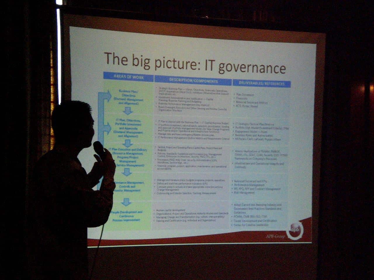
Attendees know what meeting they’ve registered for and don’t need that reminder on every slide. You’ve promised them education and learning and need to deliver to differentiate. Branded templates actually decrease learning, mute innovation and promote what’s known as “Death by PowerPoint”…heavy use of bullets and limited use of images.
2. We are all visual learners
According to Dr. John Medina, author of Brain Rules, vision trumps all other senses. We think in pictures. We dream in pictures. 80% of the brain’s processing power is dedicated to pictures. His rule of thumb for presenters is “You’ll get 3x better recall for visual information than oral. And you’ll get 6x better recall for information that’s simultaneously oral and visual”. He’s not referring to clip art, but rather rich images that help a single idea or concept stick.
3. Industry presenters will thank us
Attendees can’t read, listen and think at the same time. Challenge and teach your presenters to create image-rich and text-lite slide decks to help increase attendee learning and their presentation skills. Any use of text should have a font size of 40 points or greater for ease of reading. Most presenters should eliminate 50 – 90% of their text to align with the brain science. Less text is more. This is especially true with scientific and technical presentations!
Image selection is an art and is most effective when presenters are able to incorporate striking, unusual or novel images. Images that support metaphors and analogies can also be highly effective. Graphs and charts should be used sparingly. Emphasize that it’s not about the numbers, but what the numbers mean.
Introduce your presenters to tools like Haiku Deck, Zuru or Canva. Teach them how to get royalty free, high quality images from Flickr Creative Commons. Help them understand the science behind why image rich presentation improve attendee learning and session value. Invest in your speakers and they’ll pay you back through their appreciation, influence and delivering for you.
If the attendee and presenter advocate and brain science strategy doesn’t work, compromise by only forcing the utilization of a title and closing side. Fight for and protect the juicy filling in between.
Model the Way
If education is part of your mission, your organization is wise to adopt the latest brain science for superior learning. Once you embrace the reality that we are all visual learners, it’s important that your leadership model this in their presentations. Whether they are delivering a conference keynote, webinar or board presentation, set the bar high by adopting image rich slide decks. Create a library of exceptional slide presentations to point presenters to as a best practice. SlideShare is an excellent tool for aggregating exceptional presentations.
How do you slay sacred cow issues like branded PPT template use? Do you trust your speakers or does your organization require advance approval of all slide decks?
Adapted from Dave’s Forward Thinking column in PCMA’s Convene. Reprinted with permission of Convene, the magazine of the Professional Convention Management Association. ©2016.

